Blue Is Not a Brand Standard: Why Consistency Matters
Years ago, I had a client order a new pull-up banner for a trade show booth.
As they were setting up for the show, he called me.
The logo on the banner was the wrong color blue.
I went racing down to the convention center expecting to find a production problem.
Instead, I found something much more interesting.
I looked at the banner.
Then I looked at the brochures.
Then the business cards.
Then the other materials in the booth.
Almost every piece used a different shade of blue.
The new banner wasn’t really the problem.
The problem was that there had never been a clearly defined standard for what the right blue actually was.
“Blue” Is Not a Brand Standard
It sounds obvious when you say it that way.
But small businesses run into versions of this problem all the time.
Someone creates the original logo and chooses a blue.
Later, another person makes a flyer and chooses a blue that looks close.
Someone else creates a social media graphic and samples a blue from an old JPG.
A printer does the best they can with the file they receive.
An employee builds a PowerPoint presentation and selects something that looks about right from the color menu.
Before long, the business doesn’t have one brand blue.
It has six of them.
The same thing can happen with fonts, logo placement, backgrounds, photography, and other visual elements.
Not because anyone is intentionally changing the brand.
They simply don’t have clear standards telling them what to use.
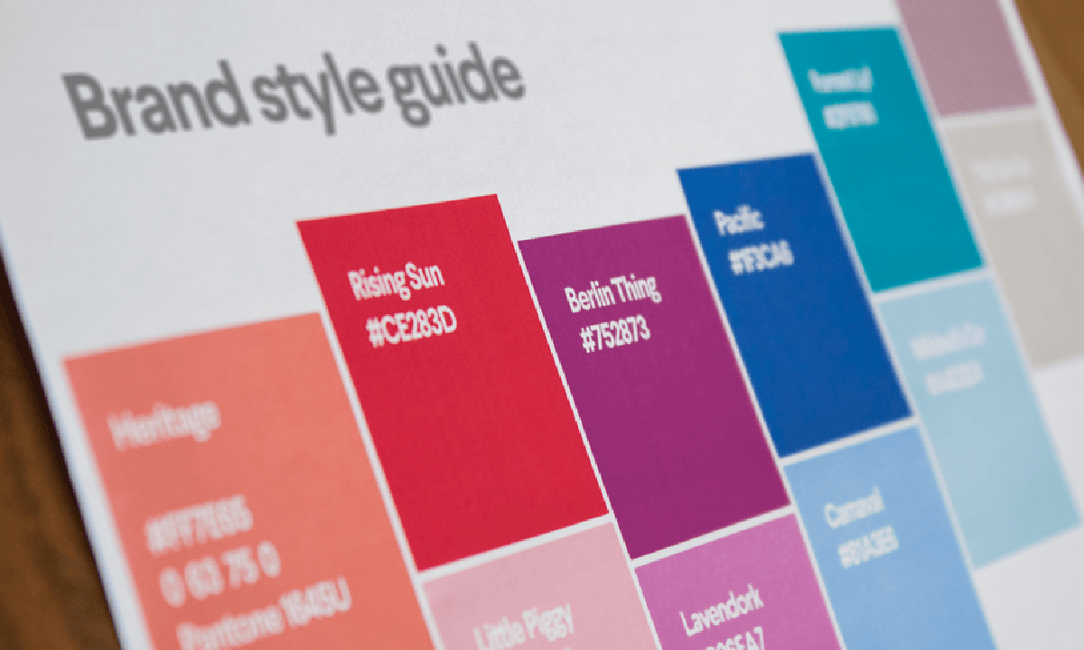
Your Brand Colors Need Names AND Numbers
If a brand color is simply described as “navy blue,” “bright red,” or “dark green,” there is still a lot of room for interpretation.
That’s why brand colors should be defined with actual color values.
You don’t need to become an expert in color theory or printing to understand the basics.
HEX
HEX codes are commonly used for websites and other digital applications.
They look something like: #465B91
A web designer can use that exact code instead of trying to visually match “our blue.”
RGB
RGB stands for Red, Green, and Blue.
It is another color system used for things viewed on screens, including websites, social media graphics, presentations, and digital advertising.
CMYK
CMYK stands for Cyan, Magenta, Yellow, and Black.
It is commonly used for commercial printing.
Because screens and printing presses create color differently, the color you see on your monitor may not reproduce exactly the same way when printed.
Having defined CMYK values gives your printer a much better starting point.
Pantone or PMS
Pantone colors are standardized colors frequently used when more precise color matching is important.
A sign company, screen printer, apparel vendor, or promotional products company may ask for a Pantone or PMS color.
Again, you don’t need to know how all of these systems work.
You simply need to have the right information available when someone asks for it.
Fonts Are Part of the Brand Too
Color isn’t the only place where visual consistency can start drifting.
Fonts matter.
Your business may have one font used for headlines, another for body copy, and perhaps an additional accent font.
Those choices help establish the personality of the brand.
A bold geometric font creates a very different impression than an elegant serif or casual handwritten font.
When everyone uses whatever font happens to be available, the visual identity begins to change from piece to piece.
Practical brand guidelines should identify:
- Primary font or fonts
- Headline font
- Body-copy font
- Appropriate weights or styles
- Acceptable alternatives when the primary font isn’t available
The goal isn’t to make designing something difficult.
It’s to make the decision easier.
Instead of wondering, “Which font should I use?” the answer is already there.
Your Logo Needs Guidelines Too
Last week, we talked about having the right logo files and versions for different applications.
But having the files is only half the solution.
People also need to know how to use them.
- Which version is the primary logo?
- Which version should be used on a dark background?
- Can the logo be placed over a photograph?
- Can the colors be changed?
- How much empty space should surround it?
- How small can it be before it becomes difficult to read?
- Should the logo ever be stretched to make it fit?
Without some basic direction, people improvise.
And improvisation is usually where inconsistencies begin.
Brand Guidelines Don’t Have to Be Complicated
The phrase brand guidelines can sound like something only large corporations need.
It may bring to mind a huge manual filled with complicated rules.
That’s not what most small businesses need.
A practical small-business brand guide may only need to include:
- Approved logo versions
- Correct logo files
- Primary and secondary colors
- HEX, RGB, CMYK, and Pantone specifications when appropriate
- Approved fonts
- Logo background guidance
- Basic spacing and sizing guidance
- A few examples of what not to do
That’s enough to answer most of the questions that come up when someone creates something for the business.
Think About Everyone Who Touches Your Brand
You may create some of your own marketing.
But you’re probably not the only person who will ever work with your brand.
At some point, your files may be used by:
- Employees
- Virtual assistants
- Web designers
- Social media support
- Printers
- Sign companies
- Apparel companies
- Promotional product vendors
- Advertising representatives
- Outside designers
Every one of those people has to make decisions about how your business should look.
Without standards, they make their best guess.
And even very good guesses won’t always match.
Consistency Helps Build Recognition
Brand consistency isn’t about making everything look identical.
It’s about creating enough familiarity that people begin to recognize your business.
The same logo.
The same colors.
The same typography.
The same overall visual personality.
Over time, those repeated elements become familiar.
And familiarity matters.
Your brand starts looking like your brand before someone even reads every word.
That doesn’t happen when every piece looks like it came from a different business.
Make It Easy to Get Right
That trade show banner taught an important lesson.
The banner wasn’t really the wrong blue.
There simply wasn’t a consistently defined right blue.
Good brand guidelines remove that ambiguity.
They give you, your employees, and your vendors the information needed to represent your business correctly without having to guess.
Because good branding shouldn’t depend on whoever happens to be creating the next piece. It should be easy to get right.
Need Help Creating a Usable Brand System?
If you already have a logo but don’t have clearly defined colors, fonts, logo versions, or practical guidelines for using them, I can help.
My Logo Suite + Brand Standards service turns your existing visual identity into an organized, usable system that makes it easier for you, your employees, and your vendors to keep your brand consistent.
Send me an email (laura@marketingblueprintsforsmallbiz.com) and let’s talk about what you need.